Favorites0 items in wishlist
The Lindner colour system is based on four main colours with clearly defined functions within the corporate design. Each colour supports specific applications. In addition, a shade gradation for each colour provides greater flexibility without sacrificing the uniformity and recognition value of the brand appearance.
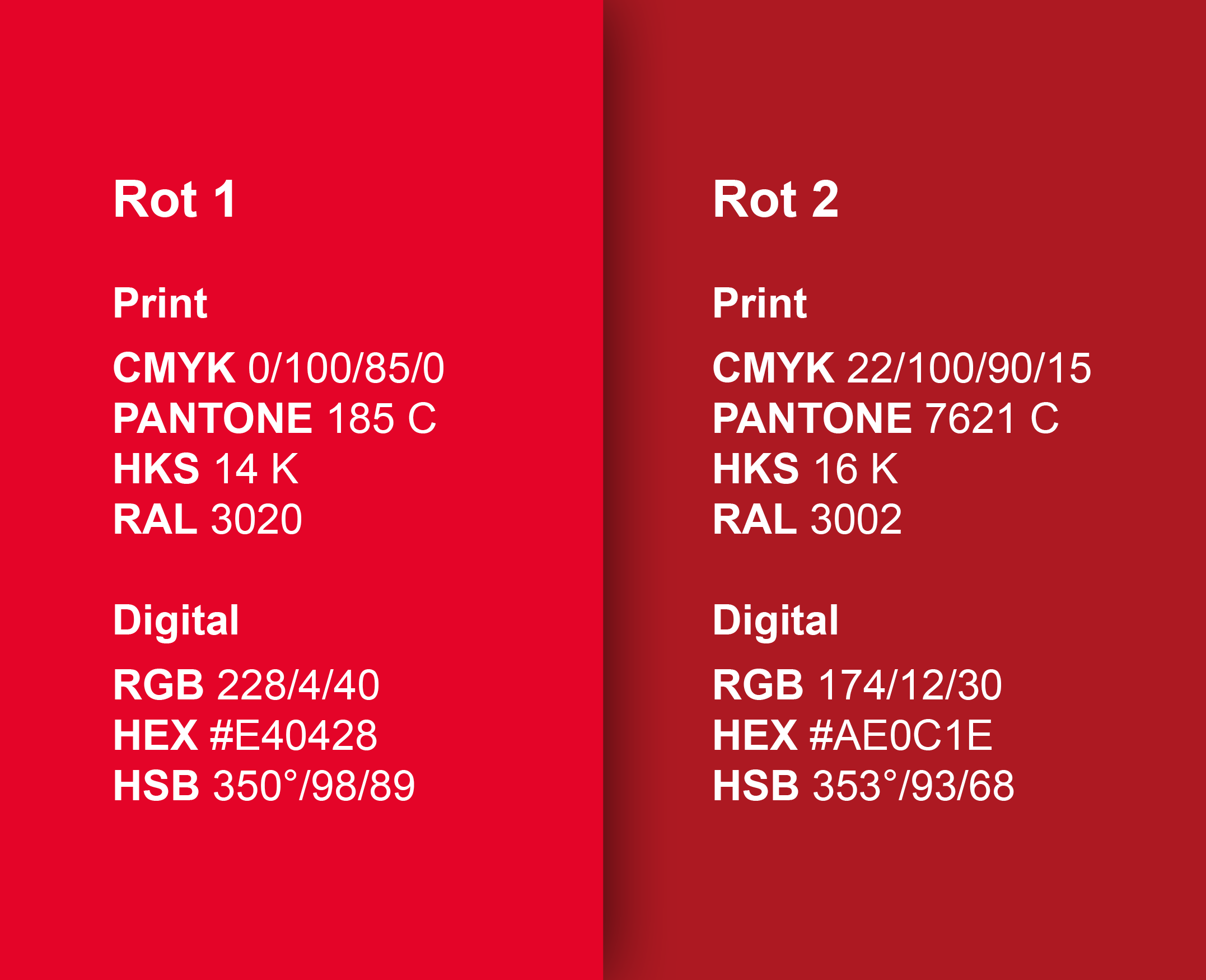
Lindner Red is the primary colour of the Lindner Group and defines our corporate design. It ensures recognition and unites all applications into a coherent brand appearance.
Red conveys power, vibrancy and strong visual impact. It stands for dynamism, drive, precision, self-confidence and progress. Lindner Red is used primarily for advertising purposes, as it makes content visible, captures attention and strengthens the brand emotionally.
As the central brand colour, Lindner Red reinforces the company's identity and makes the brand appearance clear, unmistakable and present. In combination with white or black, it creates a professional, structured and brand-compliant visual impression.

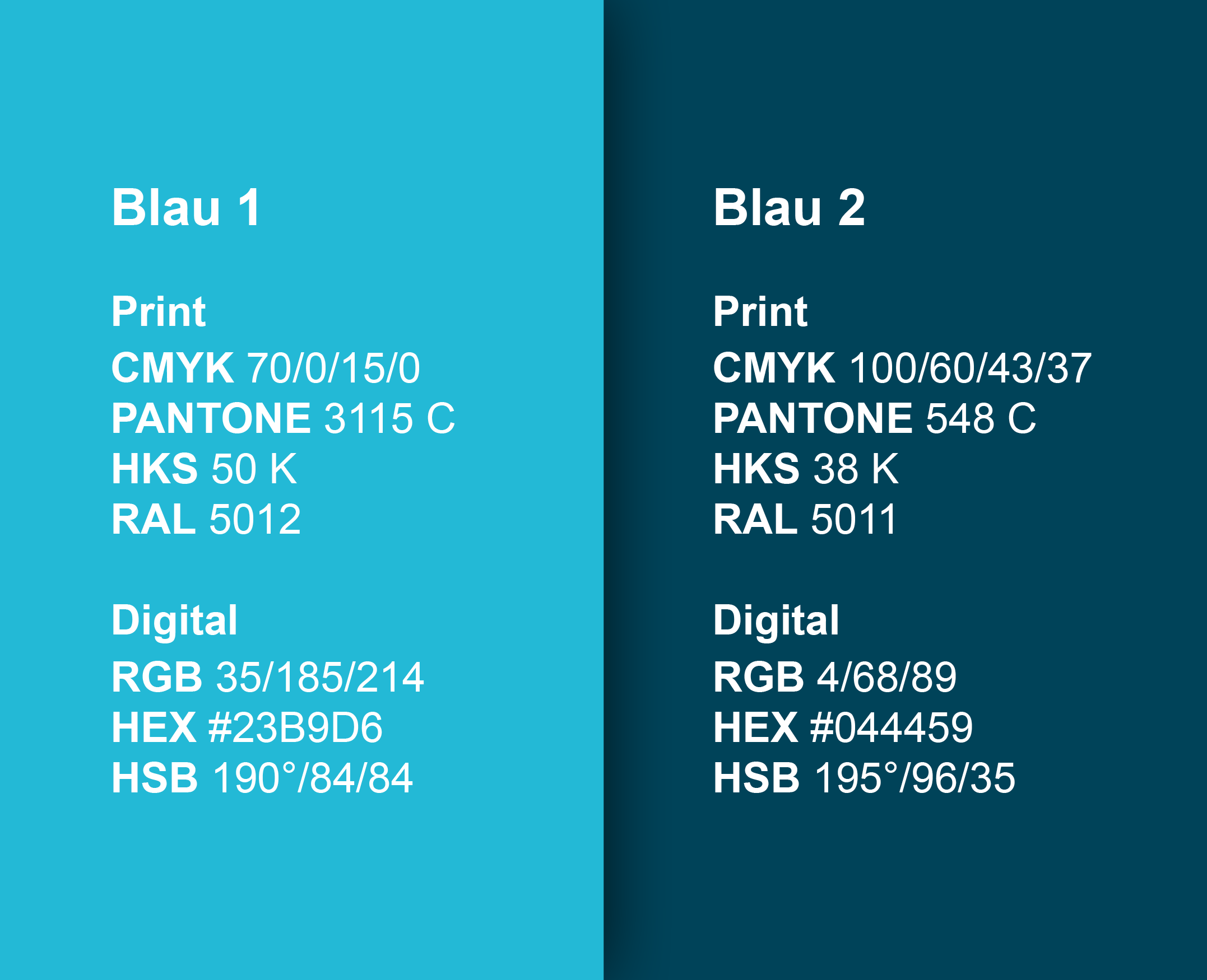
Lindner Blue is specifically assigned to the cleanroom area within our corporate design and strengthens our competitiveness in this market. Cleanrooms are frequently associated with hospitals, laboratories, the pharmaceutical industry and medical applications. Colours that convey calm, hygiene, safety and trust are therefore essential.
Blue meets these requirements particularly well: it appears clean, objective, precise and professional. In contrast to red, which signals attention, energy or warning, blue integrates harmoniously into the sensitive cleanroom context.
Thus, Lindner Blue clearly identifies the cleanroom area within the corporate design without sacrificing brand identity. At the same time, it strengthens the connection to purity, control, quality and technical safety.

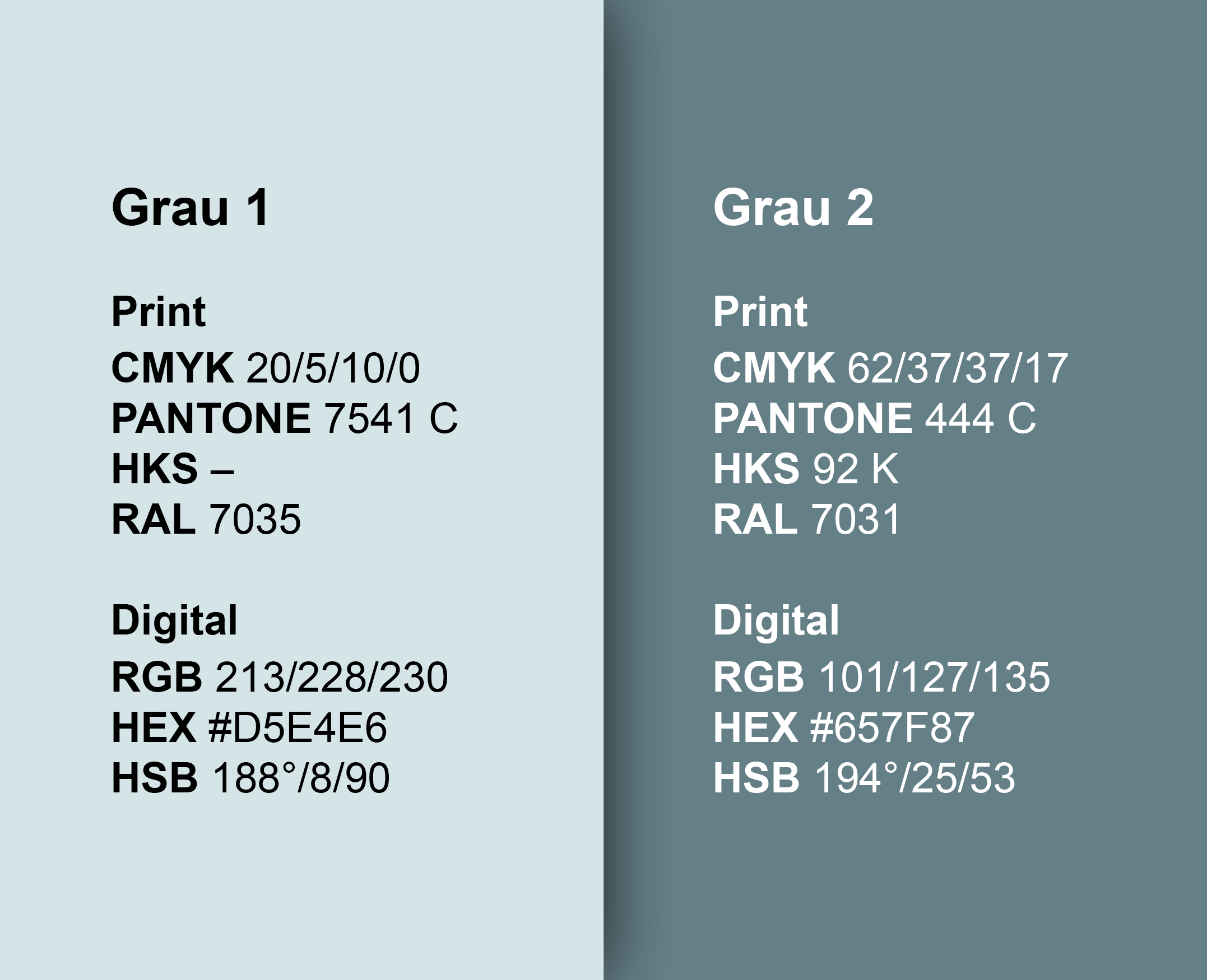
Lindner Grey is used as a secondary colour in the corporate design and is particularly suitable for technical brochures and application-related content. The colour appears objective, neutral and professional, supporting a clear, structured presentation of complex information.
Particularly for technical topics, product details, system solutions or use cases, grey creates a calm visual base. It does not distract from the content, but ensures clarity, precision and a high-quality appearance.
In combination with Lindner Red or Lindner Blue, Lindner Grey supports a modern and professional brand appearance. It conveys stability, quality and reliability and underlines the technical aspiration of the Lindner brand.

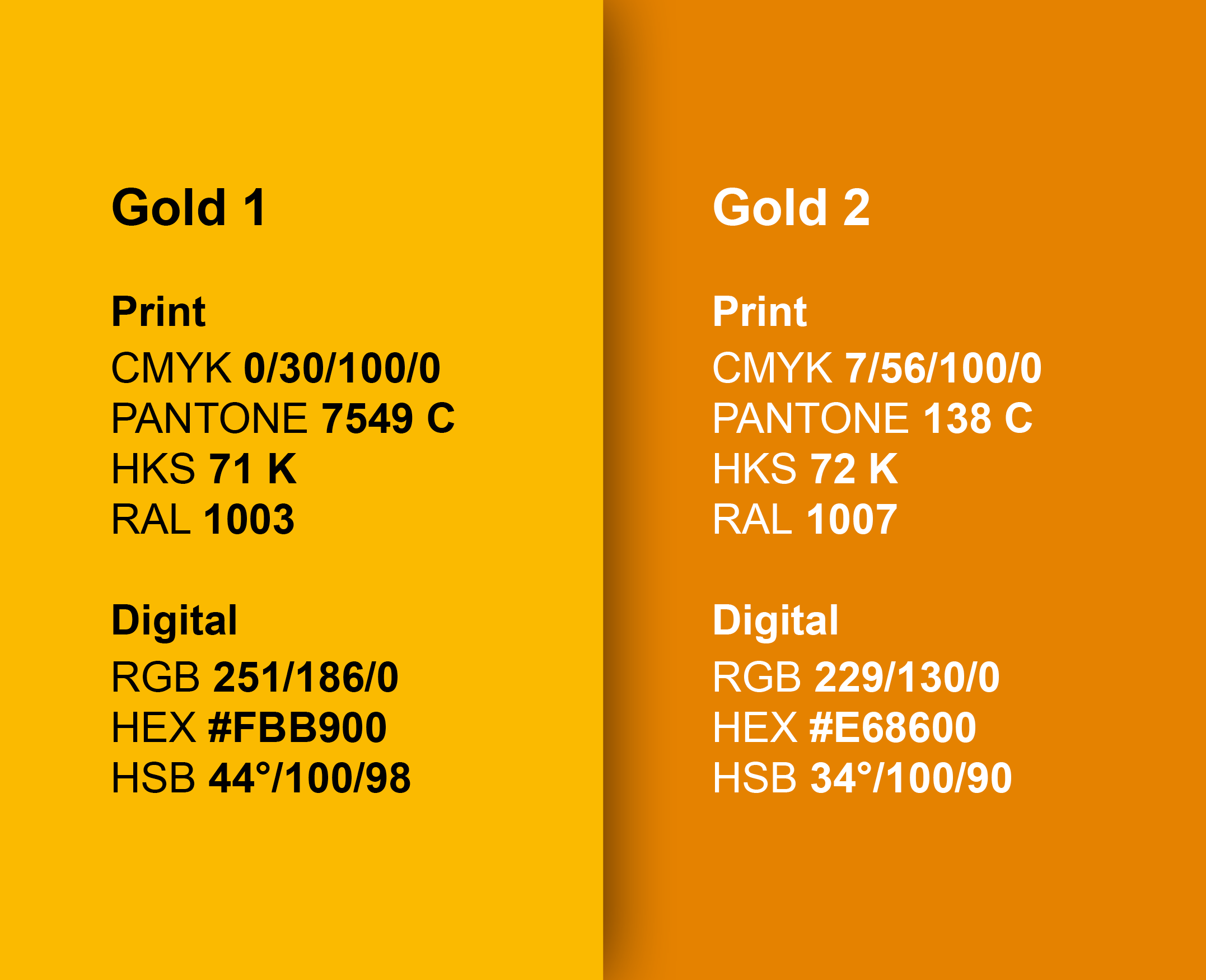
Lindner Gold is used as an accent and signal colour in the corporate design. It represents value, distinction and special attention. With its warm and noble effect, gold is particularly suited to highlighting selected content and giving it special significance.
Lindner Gold is used primarily for certificates, awards, anniversaries and festive occasions. The colour supports a high-quality and celebratory design and underlines the special character of these applications.
As a supplementary colour, Lindner Gold is used purposefully and sparingly. This keeps the design clear and brand-compliant while special moments, achievements or occasions are visually highlighted. Its use is reserved for Marketing.

Black and white form the neutral base colours in the Lindner Group corporate design, creating the foundation for legibility and clarity. They support an objective, professional design and provide structure across all applications.
Black is used primarily as the body text colour on light backgrounds. It offers strong contrast and enables precise, highly legible information delivery.
White serves as the body text colour on dark backgrounds or image backgrounds. It also ensures clear legibility and a calm, high-quality appearance.