Favorites0 items in wishlist
Univers LT Pro is a classic sans-serif grotesque (neo-grotesque) typeface. It is characterised by an objective, timeless aesthetic and a strictly modular weight system that offers maximum flexibility while providing strong recognition value.
In addition to Univers LT Pro, we use Arial as our secondary corporate typeface – specifically for our website, presentations and all internal applications. Arial is freely available on all comm
For all marketing activities and external corporate communications, the following acquired original cuts are available:
45 Light / 45 Light Oblique
55 Roman / 55 Roman Oblique
65 Bold / 65 Bold Oblique
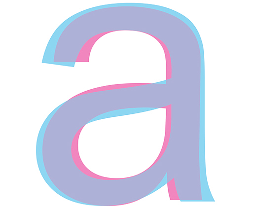
Both typefaces belong to the sans-serif grotesque family and appear comparable at first glance. However, the systematic construction of Univers becomes evident in the details: the "a" is geometrically open, with a very clean loop. It is this precision that makes the difference in professional brand media..
Overlay Analysis: Which Form Belongs to Whom?
The red areas indicate the range of Univers LT Pro, the blue areas that of Arial. Overlapping areas (purple) mark the identical base form. All non-purple edges show the exact deviations between the two typefaces.


Headlines in bold and red, subheadlines in black
Body text in at least two or three columns, left-aligned and ragged right

Text pages may be created using our red corporate background. However, text on red backgrounds must always appear in white.

On our website, we do not use red headlines. Everything is kept in black and white. Headlines are set in Univers LT Pro. Body copy is exclusively in Arial.

Please do not place black text on our red background or white text on our light background, as this severely impairs legibility.

Please use only our corporate typefaces.

Please do not experiment with our corporate typefaces – always use the designated font weights.