Favorites0 items in wishlist
We deploy graphics specifically for trade fairs and key visuals – where first impressions count and the brand must become immediately tangible. We primarily use illustrations for infographics: to render complex content comprehensible, make data tangible, and clarify interrelationships at a glance. Icons are employed for internal purposes and in the field of employer branding – for navigation, orientation, and the visual identity of our internal communications. Whether icons are appropriate for a given project is determined by Marketing on a case-by-case basis, depending on the target audience, channel and message.
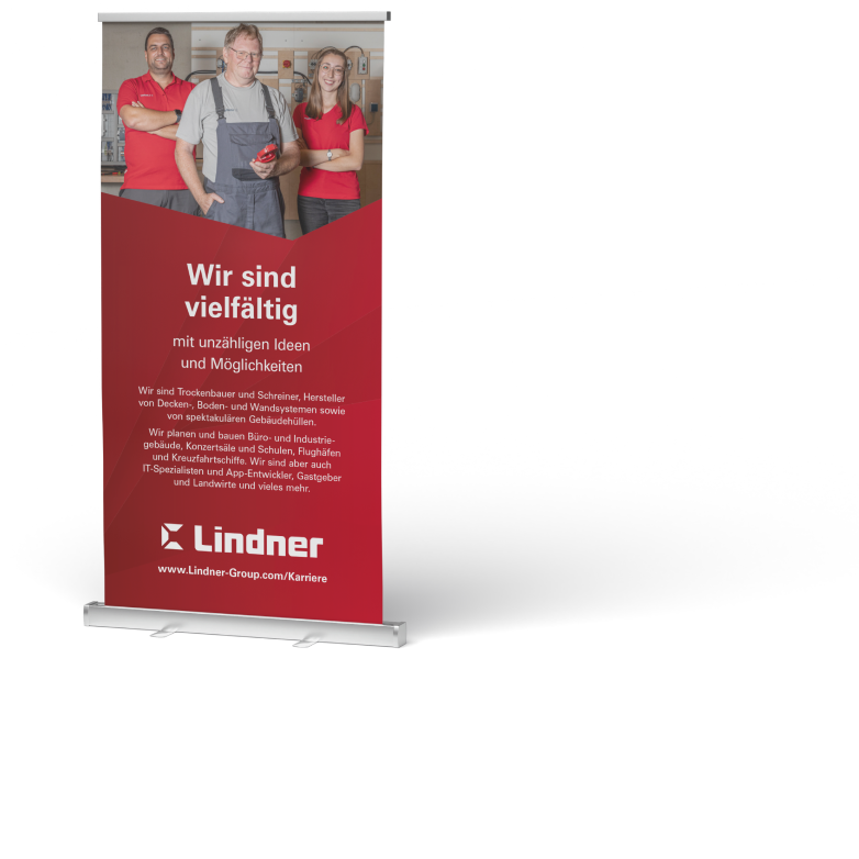
Our distinctive backgrounds serve as the unifying element of all Lindner communications. They appear across every medium – from classic printed materials, roll-up banners and exhibition walls to digital applications and our website.
The characteristic angular structure, combined with our red and white colour palette, creates a consistent visual language that makes us instantly recognisable wherever we appear as a brand.
The blue shade is reserved exclusively for cleanroom solutions, where it signals precision and the most stringent cleanliness standards.
In this way, recurring elements form a strong, familiar brand world across all channels and touchpoints.

The dynamic angle is the core design element of the Lindner corporate identity, ensuring maximum recognition across all media. Inspired by the angles of our logo, it breaks through the horizontal visual plane to create a striking aesthetic.
Depending on the medium and application, the angle appears in our signal red or in clean, minimal white – always combined with our CI backgrounds. Whether on exhibition stands, roll-up banners, digital applications or print media: the Lindner angle combines craftsmanship with high-tech, making us instantly recognisable at first glance.

We use icons deliberately and sparingly. As Lindner Group, we bring together a wide variety of companies and business divisions under one roof. That is precisely why Marketing critically assesses every application: a symbol that stands for innovation in one area could easily be misunderstood in another or associated with a different service.
To prevent identical symbols from being used for different terms in different contexts, the decision whether or not to use icons is ours alone. This avoids confusion for our customers and strengthens the recognition of our brand. Where icons do make sense – for example, for orientation in internal processes or specifically in employer branding – we deploy them consistently and as part of a strategic plan.

Graphics and key visuals form the visual backbone of our trade fair presence. With a considered, consistent design, we create instant recognition among our customers and firmly anchor our campaign themes in their minds. This ensures that Lindner Group remains present not only during the fair itself, but long thereafter.
Yet strong trade fair graphics are not created in a vacuum. They are the result of a clear strategy extending far beyond the exhibition stand. From the initial invitation card and social media teasers to post-event follow-up – every touchpoint carries the same visual DNA. This consistency builds trust: the customer experiences a brand that knows exactly where it is headed. One that leaves nothing to chance. That does not merely promise quality, but delivers on it visually.

We use illustrations primarily in infographics and campaigns. They make complex topics tangible, give data a narrative and convey our messages in a distinctive visual language. In doing so, we not only capture attention – we remain memorable.
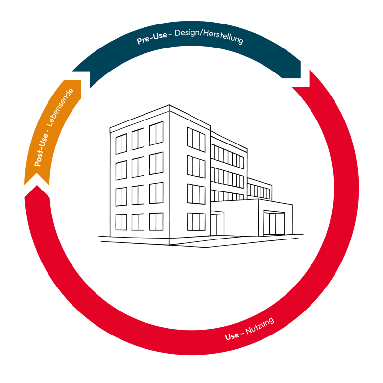
Illustrations achieve far more than mere decoration. They help explain concepts that would otherwise be difficult to grasp. A complex construction process becomes a comprehensible visual sequence, invisible technology suddenly takes shape, and figures easily overlooked in text achieve their full impact when combined with imagery. The result: faster understanding, better retention – and a message people are happy to share.
Our approach: Every illustration follows a clear process. First, we understand the subject matter: what needs to be communicated, to whom, and with what objective? We then reduce and consider which elements truly carry the message and what merely distracts. The final step is the design in our Lindner visual language: clear, precise and human. Never arbitrary, but always instantly recognisable.