Favorites0 items in wishlist
On this page you will find all applications of our brand. The wordmark is based on a typeface developed specifically for our brand identity. Together with our brand mark, this creates a unified, flexible brand world – the right appearance for every application.
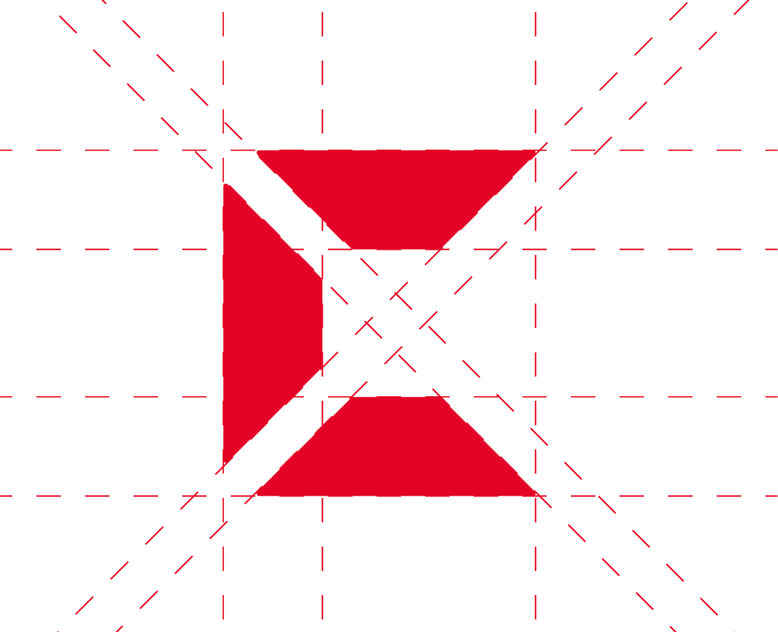
At first glance, many people see a C in our brand mark. It is an easy association to make, but in fact there is far more to it than just a letter: our brand mark stands for ceiling, floor and wall – the three elements that define a space, lend it structure and shape its character.
This is precisely where we come in. Because for us, good interior design does not emerge from individual parts, but from the perfect interplay of all surfaces. What appears to be a simple C at first glance is in truth a clear symbol for what we do – and how we think about spaces.


The red Lindner logo is our primary word and image mark. As the standard logo, it is used exclusively on a white background, ensuring maximum visibility and consistent brand impact.

For 1C printing or situations where red is not desired, the black Lindner logo is available as a secondary option. This variant is also always used on a white background.

The white Lindner logo is used for coloured backgrounds and photographic applications. This ensures that our word and image mark remains perfectly legible – regardless of the background.

The old Lindner word and image mark is no longer valid. Only the current logo may be used to ensure a consistent brand impact.

The Lindner brand is defined by its corporate red. Other colours weaken recognition – which is why our word and image mark must always appear in the defined corporate colours.

The red and black Lindner logos always appear on a white background. On coloured backgrounds or images, the white logo variant is used exclusively.

The Lindner brand mark always appears at the beginning of the wordmark, never above or below it. Only this arrangement guarantees the correct, brand-compliant representation of our visual identity.

The Lindner wordmark never appears on its own. It forms an inseparable unit with the brand mark – our complete word and image mark must always remain intact.

The Lindner logo must not be used as a 'modular system' for new brand combinations. Legally mandated exceptions are expressly not affected by this.